A link to the oficial Maxwell MXM Material Library
Català - Castellano - Deutsch
For those beginners using Maxwell Render like me, it is good to know that the Maxwell Render website has an excellent Material Library.
You will need to register to be able to download materials, but the library is huge and has tones of very good materials ready to be used in your renderings.
To help improve the library, the users can upload materials, but specially useful is to vote if the material is good so others have a reference to know if the material is worth downloading.
Searching the How To section, I found a website with some Tutorials on how to deal with Maxwell Materials, lighting, etc. I think it is worth checking out if you are trying to learn more about Maxwell Materials.
Show me more...
SketchUp Plugins: Create a 360 Degree Panorama
Do you need/want to create a 360 Degree View of your model? There is a plugin for that.
Català - Castellano - Deutsch
The Plugin Cubicpanoout.rb allows us to export 6 images to generate a 360 degrees panorama. The plugin exports the 6 images of the imaginary cube around the point were the camera is.
Be sure to have the "use sun for shading" check box activated or the "display shadows" option. Otherwise, SketchUp changes the color of the faces of objects slightly depending on the camera position, making it impossible to match the pictures afterward.
Place the camera on the center of your scene using the Position Camera Tool of SketchUp (the icon with a man standing on an "X"). After this, the process you need to follow is simple:
See the result:
The process is quite simple. Thanks to Jake Ludington on How to embed a Quick Time movie.
Show me more...
Català - Castellano - Deutsch
The Plugin Cubicpanoout.rb allows us to export 6 images to generate a 360 degrees panorama. The plugin exports the 6 images of the imaginary cube around the point were the camera is.
Be sure to have the "use sun for shading" check box activated or the "display shadows" option. Otherwise, SketchUp changes the color of the faces of objects slightly depending on the camera position, making it impossible to match the pictures afterward.
Place the camera on the center of your scene using the Position Camera Tool of SketchUp (the icon with a man standing on an "X"). After this, the process you need to follow is simple:
- Go to Camera --> CubicPano Out
- Save the Images
- Use a panomaker to create the 360 quicktime movie (see next)
See the result:
The process is quite simple. Thanks to Jake Ludington on How to embed a Quick Time movie.
Show me more...
AutoCAD: Weekly Block #03 - Multipurpose Sports Court
Download this Block and learn about Visibility States for Dynamic Blocks
Català - Castellano - Deutsch
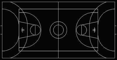
This week's block intends to show you how to play with the visibility parameters of dynamic blocks. The idea behind the Block is to be useful when showing multisport venues (I have to say that this block is mainly useful for European Countries where combining a Basketball court 28x15m with a Handball Court 40x20m is the common practice. See too, that the Basketball court block is based on the FIBA regulations, not NBA or NCAA).
To give you a better idea see a snapshot of the block. You can download the block here or clicking on the image.
The block consists of 2 other Blocks Embedded in it. One for the Basketball Court, and one for the Handball Court. But because I wanted to use a single block to show the different possibilities (i.e. Basketball court Alone, Handball Court Alone or Both together like in the snapshot) I added visibility states to achieve it.
To do that once the block is created, you need to open the Block Editor and add a parameter. When asked which parameter you want to add, type "V" for visibility. Once the parameter is set, you need to create the visibility states. This can be easily done with the controls on the upper right corner of the Block Editor interface. See the image.They are the following.
Pretty simple isn't it? Now exit the block editor (saving the changes) and see how when you select the block there is a new grip that when you click on it will show the 3 visibility states. Pick the one you want and you will see if you did the process right.
If you want to repeat the process I showed here you can download this block that doesn't have the Parameters and Visibility states Added.
Show me more...
Català - Castellano - Deutsch
This week's block intends to show you how to play with the visibility parameters of dynamic blocks. The idea behind the Block is to be useful when showing multisport venues (I have to say that this block is mainly useful for European Countries where combining a Basketball court 28x15m with a Handball Court 40x20m is the common practice. See too, that the Basketball court block is based on the FIBA regulations, not NBA or NCAA).
To give you a better idea see a snapshot of the block. You can download the block here or clicking on the image.
The block consists of 2 other Blocks Embedded in it. One for the Basketball Court, and one for the Handball Court. But because I wanted to use a single block to show the different possibilities (i.e. Basketball court Alone, Handball Court Alone or Both together like in the snapshot) I added visibility states to achieve it.
To do that once the block is created, you need to open the Block Editor and add a parameter. When asked which parameter you want to add, type "V" for visibility. Once the parameter is set, you need to create the visibility states. This can be easily done with the controls on the upper right corner of the Block Editor interface. See the image.They are the following.
- Toggles objects on other visibility states on and off.
- Makes an object visible in the current visibility state
- Hides an object form the current visibility state
- Calls the visibility states dialog box (where we will create different visibility states)
- first we have to do is click button #4 and create a new visibility state called Basketball, antoher One Called Handball and rename the existing one as Both.
- Having Basketball visibility state active, select the Handball court and click button #3 to hide it. (the court will diappear if you didn't click button #1, if you did the court will fade)
- Turn Handball visibility state active, select the Basketball Courtand hide it (button #3)
Pretty simple isn't it? Now exit the block editor (saving the changes) and see how when you select the block there is a new grip that when you click on it will show the 3 visibility states. Pick the one you want and you will see if you did the process right.
If you want to repeat the process I showed here you can download this block that doesn't have the Parameters and Visibility states Added.
Show me more...
Maxwell Render: How to Make a Transparent Material
A quick reminder on how to turn an opaque material into a transparent one.
Català - Castellano - Deutsch
I was recently in charge of rendering some quick views of a project we are designing at work. We didn't have much time to spend on it and needed some very basic trees to give the effect of the surrounding site. I had some low polygon trees downloaded from the 3dWarehouse, and wanted to add some leave material but make it transparent so I could see the buildings beyond the trees.
Since I use Maxwell every now and then I had completely forgotten how to add transparency to an existing material. Luckily I got some help. The process is very simple.
Let's use a quick scene to see how to do this. See the image below.
The material shown on the left is the one applied to the cube closer to the camera on the scene. You can see the material has only one BSDF (Bidirectional scattering distribution function, see the wiki link to this topic). To add the transparency, we can either make the existing BSDF transparent or add a new one. Adding an extra BSDF for the transparency has the advantage of letting you play more with the blending of both BSDF.
To add Transparency we have to do the following steps:
Having two BSDFs allows us to play with them to reach the material we want. In this case, I want the material to be transparent, but also to show the original brownish colour. To do that I set the blending weight of the transparent layer to 50 and that way I reduce the importance of the transparent layer in the material. Now I get to see again the brownish colour of the material while still having it transparent.
I am still pretty new to Maxwell Render, so please if you think there is a better way to face this process please don't hesitate to comment on this post.
Show me more...
Català - Castellano - Deutsch
I was recently in charge of rendering some quick views of a project we are designing at work. We didn't have much time to spend on it and needed some very basic trees to give the effect of the surrounding site. I had some low polygon trees downloaded from the 3dWarehouse, and wanted to add some leave material but make it transparent so I could see the buildings beyond the trees.
Since I use Maxwell every now and then I had completely forgotten how to add transparency to an existing material. Luckily I got some help. The process is very simple.
Let's use a quick scene to see how to do this. See the image below.
The material shown on the left is the one applied to the cube closer to the camera on the scene. You can see the material has only one BSDF (Bidirectional scattering distribution function, see the wiki link to this topic). To add the transparency, we can either make the existing BSDF transparent or add a new one. Adding an extra BSDF for the transparency has the advantage of letting you play more with the blending of both BSDF.
To add Transparency we have to do the following steps:
- Add a new BSDF
- Turn Transmittance Colour to White (100% transparent)
- Increase the Attenuation to 999m (see that the default units are nm, change that to m)
- Turn the Roughness of the material to a very small value (i set it at 0 on this example)
Having two BSDFs allows us to play with them to reach the material we want. In this case, I want the material to be transparent, but also to show the original brownish colour. To do that I set the blending weight of the transparent layer to 50 and that way I reduce the importance of the transparent layer in the material. Now I get to see again the brownish colour of the material while still having it transparent.
I am still pretty new to Maxwell Render, so please if you think there is a better way to face this process please don't hesitate to comment on this post.
Show me more...
Enhancing CAD Drawings with Photoshop
An essential Book if your work flow involves CAD drafting and then the use of Photoshop for presentations
Català - Castellano - Deutsch
Author Scott Onstott published a Book on How to Enhance your CAD Drawings Using Photoshop. Beeing this one of the main processes we usually do I think it was worth mentioning here.
The book has great reviews and it is probably the only one facing this subject directly, so many architect will find it very useful to streamline the way they work daily with this two tools.
The book even comes with an AutoLISP routine to translate AutoCAD layers into Photoshop ones. You have to be careful when you use this routine since it might crash your drawing if you don't have a powerful machine, but it is an efficient tool.
If your regular work scheme involves drafting in CAD and then coloring drawings in Photoshop you should definitively give this book a try. It is worth the price.
Show me more...
Rhino: The Equivalent of 3Ds Soft Selection - SOFTMOVE
The Softmove Rhino Command allows us to do something similar as the Soft Selection from 3DS.
Català - Castellano - Deutsch
In 3D Studio, Soft Selection is used to move points depending on the distance they are from a central selection point. That is done by using the Soft Selection Method. The closer the points are the more they will be displaced, the further the lesser. See this image borrowed from this website.
The red areas would be displaced 100% while the "colder" the color the lesser the objects would move.
I needed to do something similar while modelling a site in Rhino. I had some Linework of the Roads and needed to turn it into 3D lines. Luckily in RHino, if you don't know a command you guess and sometimes you get the right one. So I started typing SOFT... because I remembered the Soft Selection function in 3Ds, and SOFTMOVE came as an option.
To quickly show you what SOFTMOVE does I'll use a simple patch. Imagine you have a flat surface created with the PATCH command. Select the surface and press F10 (pressing F10 in Rhino activates the control points of selected objects) and select its control points. You should see something like this.
Then we type SOFTMOVE, click on the point we want to move more and select a radius. The radius will determine till what extend the moving process will affect (the points outside the radius will not be moved). We then set the distance we want the central point to move and select in which directions we want the movement to happen. In this case I chose to move the point vertically and this is the result.
It is a useful command to have in your list. ANd remember in Rhino, if you want to do something just start typing what you want to do and most of the times there will be a command named that way or very similarly.
Show me more...
Labels:
Rhino
Job Directory
This is the CAD Addict Job Directory. Visit often for more Job opportunities.
We have partnered with Workcircle to provide a comprehensive data base of TOP Jobs in different countries. You can check some of the Jobs listed in the different categories/regions or use the Search Box at the bottom of the screen to search for a job. We will continue to search for the best resources to provide Job opportunities in these difficult moments.
Job Type: Architect
Job Type: CAD Related
Show me more...
AutoCAD: Do You Want to use it on your Mac?
Do you want to be able to use AutoCAD in your Mac without having to install Windows? Tell Autodesk About it.
Català - Castellano - Deutsch
Autodesk has started a Survey to know if its worth developing the new version of AutoCAD to be usable in the latest Mac operating systems. I do not use Mac but if any of you do, probably you are using Parallel Desktops or something similar to run Both the Mac OS and Windows. Well that might change if enough people show their interest. The survey not very long so if you are a MAC user, better put 5 minutes into it!
Some months ago I wrote a post about what to do if you wanted to run AutoCAD without windows. The only solution available by then came from a comment by e2002 who said he was able to run AutoCAD in Linux with overall good performance.
Maybe soon the MAC community will be able to do that to...Or maybe some of us will switch to MAC?
Show me more...
AutoCAD Weekly Block #02: Dynamic Dinning Table
Download this Block and learn about Standard Sizes for Dynamic Blocks
Català - Castellano - Deutsch
Last week I started the Weekly Block section with a Dynamic Wardrobe block and a tutorial on how to use the Stretch and Array Actions.
This week´s block is a Dinning Table block. You can download it here. The block is dynamic too, so it can be transformed from a dinning table for 4 people to a table for 6, 8, 10 or 12 people.
To do that, I used a Linear parameter and Stretch and Array actions. Since I already explained on last week's post and on a previous one how to use these features, I am going to skip this explanation today.
What we will focus today is on how to set standard sizes for dynamic blocks. Once we have the Block set with the parameters and actions associated working properly we want to limit how the block can be modified.
In our example, we want the length of the table to change in increments of 0.80 meters. What we have to do is the following. Being in Block Editor mode, select the distance parameter you want to set standard sizes to. On the properties palette go to Value Set --> Distance Type and select List.
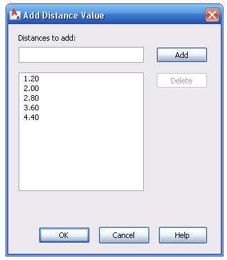
After that we need to add the values the list. Click on the 3 dots on the right of the "Dist Value List" Box. A dialog opens like the one below where you can add the list of values you want the distance parameter to take.
The 1.20 value is there because it is the value of the distance parameter when we created it. We will add the values 2.00, 2.80, 3.60 and 4.40. Now, you can exit the block editor and test the block. You will see that when you select the grip to stretch the table, some markers appear on the screen showing you the possible sizes coming from this list that we created.
Since we set the Array column offset distance to be also 0.80m any time we change the length of the table we will see some extra chairs appearing.
The great thing of dynamic blocks is that if used smartly they can simplify things a lot. Before you probably had a Block for a table sitting 4 people, another for a table sitting 6, another for a table sitting 8 etc. Now, you only need one configured like this one and it will work for all them.
Download the Block Here
Show me more...
AutoCAD Architecture: Irregular Walls - Endcap Tutorial
Learn how to use Endcaps. They are very useful when you want your wall openings to be more than just a square.
Català - Castellano
We have been designing a "not very modern" type of building (to say something) in the office. One of the things we have to deal with is the fact that this Gothic-Art Decoish building will have heavy pilasters on the façade to resemble some sort of old architecture.
In previous phases of the project we had been just using regular walls and adding the extra depth of the pilasters with an AEC polygon. Since we were printing with both wall boundary and wall hatch in black, that worked good enough for representation, but it was a pain in the ass when editing the wall, moving windows,etc.
On the current phase, we are reverting to a different kind of representation following more the standards set in the office. This means black boundry line + grey hatch for the wall. The problem is that if we use a regular wall and we add a AEC Polygon to the outside of it to get the extra thickness needed, we will see the line separating the wall and the AECP, and we do not want that.
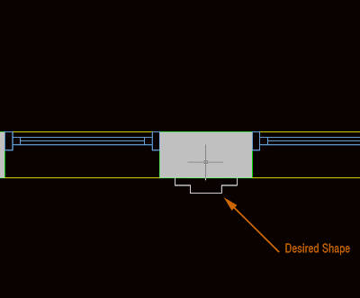
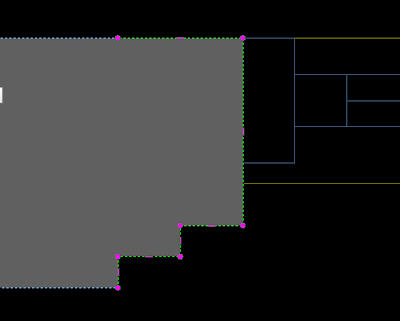
The solution I found for this problem is to use the Wall Endcaps. But let´s start first with a picture of what we want to achieve.
As you see, we have a regular wall and some windows, but we want the space between the windows (what is the name in English for that?) to have the shape of the white line. To do that, we first increase the thickness of the wall to reach the thicker point necessary. THen we select the wall, right mouse click and select Endcaps --> Edit in Place. We will access the endcap edit mode. Endcaps work exactly as AEC Polygons, so take a look at this post on how to edit AEC Polygons. In the image below you can see the endcap after being edited in the Endcap Edit in Place Mode.
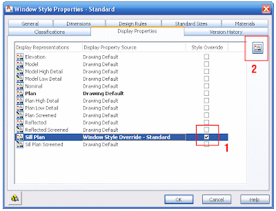
But when we exit, we see that the Window sill is showing like floating (this is because the window sill is showing the actual thickness of the wall). We have to edit the window style to fix this. Right click the window --> Edit window Style (if you just want to edit one window of this style you can pick "Edit Object Display")
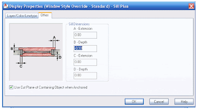
In this dialog, we have to edit the Sill Plan. Click on the box to the right of the Sill Plan and go to Edit Display Properties on the upper right. In the following dialog we need to click the "other" tab. Here is where we will set how much we want the Sill to be recessed from the wall edge to show the way we want it. In our example we need to set the B dimension to -0.10 (negative will make the sill be recessed)
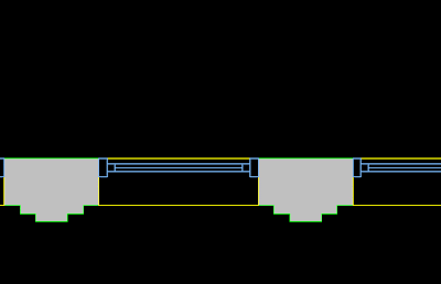
The final result is the desired. See the image below for the final wall with its irregular shape and the sill aligned to where we wanted.
Show me more...
Labels:
AutoCAD Arch,
Walls
SketchUp Plugins: Delete Unnecessary Lines
Imported drawings can have a lot of unnecessary lines, there is a plugin to remove them all with a single click.
Català - Castellano
When we import CAD drawings to generate 3D geometry from them we might end up with hundreds of lines that we don't really need. Cleaning up the drawing of unnecessary lines is important to work more efficiently, but it can be tedious sometimes.
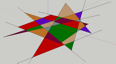
A Plugin that helps a lot on this task is the Stray_Lines.rb Plugin. With this plugin we can either Delete, Isolate (meaning hiding the rest of the model), Label or Select all the lines in a model that have an open end (and thus are not being used to generate a face). See the image below, where we have a bucnh of faces and lines that are not needed.
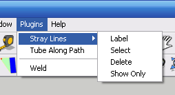
TO get rid of those lines, we could manually erase them. In this case it wouldn't take long, but imagine that instead of 10 lines like here we had 100 or 1000. So what we have to do is simply go to Plugins --> Stray Lines --> Delete. And it will delete any line with an open end.
See in the image that there are 4 options total. Each of them useful in a way or another. Try them out. You can download the Plugin here.
Show me more...
Labels:
Downloads,
File Clean Up,
Plugins,
SketchUp
SketchUp Plugins: Make Faces from lines
Learn about a Plugin that will allow you to generate faces from existing linework.
Català - Castellano - Deutsch
The Plugin Makefaces.rb allows us to generate a face or multiple faces from existing linework. It is very useful both to generate faces but also to know how clean our geometry is.
It is very simple to use. Once installed, simply select the lines and go to tools --> Make Faces. If there are any possible faces to be created from the selected lines it will create them, giving you at the end a report of how many faces it has generated.
I use it quite a lot, I even have a shortcut for it (CTRL + M).
Download it here and give it a try. You will need to download this Script too: Progressbar.rb
This is an old post from 2009. you might want to check other Sketchup related posts.
Show me more...
Show me more...
Subscribe to:
Posts (Atom)