Learn how to edit a script to re-create all you standard layers
Català - Castellano - Deutsch
Having your standard layers is basic for easy printing and having everyone in the same office know which layers to use for each object. The creation of standard layers and plot tables can be long but it is important if you are trying to set your own standards for several projects.
Some layers are deleted when using commands like PURGE. To get them back there are several methods. One of them is to have a Script that creates all the layers again. This sample script will generate only 3 layers, but it is useful to see how this type of script works. To test the script, save it to your hard drive and type SCR in AutoCAD. Then Browse to the folder where you have saved it and select it. The syntax of the script is as follows:
What you see after ;;; signs is pure description. The script consists of 3 lines. It calls the -LAYER command (See that it uses the hyphen version of the LAYER command, so it does not call the Layer manager window). After each -LAYER there is MAKE to create a new Layer. Then each of the properties of that layer are set.
Following the syntax of this Script with the properties of your standard layers you can generate a script that will allow you to quickly recover all the layers that have been deleted. Here is the link to the Script again.
Show me more...
Showing posts with label Downloads. Show all posts
SketchUp: Buy SketchUp 7 Pro with a $100 discount
Google is offering the new version of SketchUp with $100 off till May 15th
Català - Castellano - Deutsch
As seen on Arch Daily, Google is offering a discounted version of SketchUp 7 Pro till May 15th 2009. If you were considering going Pro, this is definitely the right time to do it. The Pro version retails at $495, to get the discounted version, go to the Google store and apply this discount code: SUAIA9.
If you are not yet ready to spend the money on the Pro version remember that you can download the fee version of SU 7 here. Remember though, that the promo code will only be good till May 15th.
Show me more...
AutoCAD Weekly Block #04: Dynamic Vanity/Washbasin
Download this Blog and learn to use the Move action and distance multipliers to keep an object always centered
Català - Castellano - Deutsch
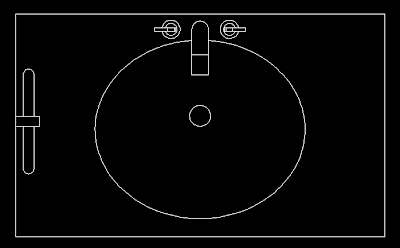
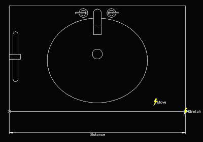
This week's Block is a Vanity with stretchable properties and that keeps the washbasin always centered. You can download the block clicking on the image below.
The block is pretty simple, it ahs only one parameter, the distance from one edge to the other, and two actions. The first action is a Stretch action to stretch the contours of the vanity. The second action is a move action to move the washbasin. I have linked both actions to the same parameter for simplicity and to show you how to keep an object centered when modifying a dynamic block. See the Block editor snapshot of the block.
We want the washbasin to stay centered when we stretch the block. This, if you think about it, means that for every unit we stretch the block, we want the washbasin to move 0.5 units.
To do this we need to set a distance multiplier for the move action. We can do that two ways. First one, when you create the action, at some point in the command line you will see this.
If you press M, you will be able to set the 0.5 as distance multiplier. The other option you have, in case you forgot to set this when you created the action, is to select the move action, and go to the properties tab. There, under overrides, you can set the distance multiplier.
What is the other option you see near multiplier? Offset. I will talk about it on next week's Weekly Block.
Show me more...
AutoCAD: How to Create a Custom Hatch Pattern with Text in it
This how I did it. It was a bit long but it helped me understand what to deal with when creating you own patterns.
Català - Castellano - Deutsch
On my last post, I analysed how the Hatch Pattern files work. How they define the patterns through straight lines and what is the syntax they use. I was not entirely satisfied with all I learned and wrote here so I decided to go from the theory to the practice and try to create my own hatch pattern file.
I decided to not attempt just a random pattern, but one that required certain precision. So I set the goal to create a pattern that would repeat the text CAD-Addict.com. Possible? yes it is.
The process started by creating the text. If you remembered what I wrote on the previous post, a pattern is created by straight lines with linetypes that we can decide that repeat themselves the way we decide to. So how would we do it to show a text on our hatch pattern just with some straight lines? We had to find a way to align the lines of the text on a way that they would repeat themselves in different directions. Let's see an image to understand this.
The text with the C circled in Red is the original one, the ones circled in Yellow are the ones I used to be sure the lines allign. See that this text has only lines at 0 degrees, 90 degrees, 45 degrees and 135 degrees. Alligning the o degree lines it is easy. The important part is to manage to allign the 45/135 degrees and do it in a way that the 90 degree ines also allign. In this case the fact that the tilted lines are 45/135 degrees makes it easy, if the there where other angles it would have been much more difficult. (The original text, created with the standard AutoCAD text style, had the lines on the upper part of the A at a different angle, but I modified that to make the pattern file more easy to create. See in the image below, how with the original text there was no easy way to find common lines for the A.
The process I followed once I had the text aligned is simple. First I started to set up the 0 degree lines (Remember to check the previous post for more details on the syntax of the Hatch PAttern files).Picking the lower left corner of the C as 0,0 point it was all a question of measuring distances. Something you need to know is that linetypes in hatch patterns can only use 6 elements from DASH SPACE or DOT. We define DASH with positive value, space with negative and point with a zero. See the hatch pattern definition of the horizontal lines and you will get a better glimpse of what I mean.
The text highlighted in yellow doesn't belong to the pattern definition, I added it for reference while building the pattern file. As you can see, although all the lower horizontal lines of the letters are aligned, I couldn´t define them in a single line definition because I would have exceeded the maximum of 6 elements for the line type definition.
Lets go back to how the pattern file works. The first number defines the angle of the line, the second and third (the second column) defines the start point coordinates of that line, the 4th and 5th number (3rd column) describe the delta-x and delta-y of the line. This point requires certain attention. Lets take for instance the horizontal lines. The delta-x and delta-y I had to use was -1.0607,1.0607. Lets see graphically what that means.
The last column might have no values at all (if the line is continuous), or up to 6 to define its linetype. For the lower horizontal lines for the letters C, D and d, the pattern file I created describes 0.1,-0.4475,0.1475,-0.7949,0.0508,-2.702 as linetype. THis means 0.1 of dash,0.4475 of space,0.1475of dash,0.7949 of space,0.0508 of dash,2.702 of space. Why is the last space so much bigger than the other ones? Because it describes the distance between the last dash and the first one on the next text. See the image below and compare the dimension values to the first 4 ones above.
The 6th value, on the 4th column, the one that is disproportionately bigger compared to the others, belongs to this dimension.
I after all this information you don't still feel like you could create your won pattern, I can only tell you that the best way is to try to create one. Suddenly all the abstract concepts you are reading will start making sense.
Just a couple of points I discovered while creating the pattern file. Be sure there is at least one blank line at the end of all the definitions, or AutoCAD won't accept the pattern. Also, once you have created the YOURPATTERN.pat file (or while creating it to test it) save it under the following where all the Custom Patterns are in AutoCAD. generally that folder is under C:\Documents and Settings\USERNAME\Application Data\Autodesk\AUTOCADVERSION\enu\Support\pats.
If you want to see or test the pattern definition I created., you can download it here. And below you can see a snapshot of the pattern generated by the file.
I know the pattern is not very useful for everyday life, but creating it was very useful to understand how to create a custom hatch pattern.
Show me more...
Labels:
AutoCAD,
Downloads,
Hatch Patterns
Maxwell: MXM Material Library
A link to the oficial Maxwell MXM Material Library
Català - Castellano - Deutsch
For those beginners using Maxwell Render like me, it is good to know that the Maxwell Render website has an excellent Material Library.
You will need to register to be able to download materials, but the library is huge and has tones of very good materials ready to be used in your renderings.
To help improve the library, the users can upload materials, but specially useful is to vote if the material is good so others have a reference to know if the material is worth downloading.
Searching the How To section, I found a website with some Tutorials on how to deal with Maxwell Materials, lighting, etc. I think it is worth checking out if you are trying to learn more about Maxwell Materials.
Show me more...
SketchUp Plugins: Create a 360 Degree Panorama
Do you need/want to create a 360 Degree View of your model? There is a plugin for that.
Català - Castellano - Deutsch
The Plugin Cubicpanoout.rb allows us to export 6 images to generate a 360 degrees panorama. The plugin exports the 6 images of the imaginary cube around the point were the camera is.
Be sure to have the "use sun for shading" check box activated or the "display shadows" option. Otherwise, SketchUp changes the color of the faces of objects slightly depending on the camera position, making it impossible to match the pictures afterward.
Place the camera on the center of your scene using the Position Camera Tool of SketchUp (the icon with a man standing on an "X"). After this, the process you need to follow is simple:
See the result:
The process is quite simple. Thanks to Jake Ludington on How to embed a Quick Time movie.
Show me more...
Català - Castellano - Deutsch
The Plugin Cubicpanoout.rb allows us to export 6 images to generate a 360 degrees panorama. The plugin exports the 6 images of the imaginary cube around the point were the camera is.
Be sure to have the "use sun for shading" check box activated or the "display shadows" option. Otherwise, SketchUp changes the color of the faces of objects slightly depending on the camera position, making it impossible to match the pictures afterward.
Place the camera on the center of your scene using the Position Camera Tool of SketchUp (the icon with a man standing on an "X"). After this, the process you need to follow is simple:
- Go to Camera --> CubicPano Out
- Save the Images
- Use a panomaker to create the 360 quicktime movie (see next)
See the result:
The process is quite simple. Thanks to Jake Ludington on How to embed a Quick Time movie.
Show me more...
AutoCAD: Weekly Block #03 - Multipurpose Sports Court
Download this Block and learn about Visibility States for Dynamic Blocks
Català - Castellano - Deutsch
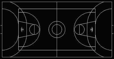
This week's block intends to show you how to play with the visibility parameters of dynamic blocks. The idea behind the Block is to be useful when showing multisport venues (I have to say that this block is mainly useful for European Countries where combining a Basketball court 28x15m with a Handball Court 40x20m is the common practice. See too, that the Basketball court block is based on the FIBA regulations, not NBA or NCAA).
To give you a better idea see a snapshot of the block. You can download the block here or clicking on the image.
The block consists of 2 other Blocks Embedded in it. One for the Basketball Court, and one for the Handball Court. But because I wanted to use a single block to show the different possibilities (i.e. Basketball court Alone, Handball Court Alone or Both together like in the snapshot) I added visibility states to achieve it.
To do that once the block is created, you need to open the Block Editor and add a parameter. When asked which parameter you want to add, type "V" for visibility. Once the parameter is set, you need to create the visibility states. This can be easily done with the controls on the upper right corner of the Block Editor interface. See the image.They are the following.
Pretty simple isn't it? Now exit the block editor (saving the changes) and see how when you select the block there is a new grip that when you click on it will show the 3 visibility states. Pick the one you want and you will see if you did the process right.
If you want to repeat the process I showed here you can download this block that doesn't have the Parameters and Visibility states Added.
Show me more...
Català - Castellano - Deutsch
This week's block intends to show you how to play with the visibility parameters of dynamic blocks. The idea behind the Block is to be useful when showing multisport venues (I have to say that this block is mainly useful for European Countries where combining a Basketball court 28x15m with a Handball Court 40x20m is the common practice. See too, that the Basketball court block is based on the FIBA regulations, not NBA or NCAA).
To give you a better idea see a snapshot of the block. You can download the block here or clicking on the image.
The block consists of 2 other Blocks Embedded in it. One for the Basketball Court, and one for the Handball Court. But because I wanted to use a single block to show the different possibilities (i.e. Basketball court Alone, Handball Court Alone or Both together like in the snapshot) I added visibility states to achieve it.
To do that once the block is created, you need to open the Block Editor and add a parameter. When asked which parameter you want to add, type "V" for visibility. Once the parameter is set, you need to create the visibility states. This can be easily done with the controls on the upper right corner of the Block Editor interface. See the image.They are the following.
- Toggles objects on other visibility states on and off.
- Makes an object visible in the current visibility state
- Hides an object form the current visibility state
- Calls the visibility states dialog box (where we will create different visibility states)
- first we have to do is click button #4 and create a new visibility state called Basketball, antoher One Called Handball and rename the existing one as Both.
- Having Basketball visibility state active, select the Handball court and click button #3 to hide it. (the court will diappear if you didn't click button #1, if you did the court will fade)
- Turn Handball visibility state active, select the Basketball Courtand hide it (button #3)
Pretty simple isn't it? Now exit the block editor (saving the changes) and see how when you select the block there is a new grip that when you click on it will show the 3 visibility states. Pick the one you want and you will see if you did the process right.
If you want to repeat the process I showed here you can download this block that doesn't have the Parameters and Visibility states Added.
Show me more...
AutoCAD Weekly Block #02: Dynamic Dinning Table
Download this Block and learn about Standard Sizes for Dynamic Blocks
Català - Castellano - Deutsch
Last week I started the Weekly Block section with a Dynamic Wardrobe block and a tutorial on how to use the Stretch and Array Actions.
This week´s block is a Dinning Table block. You can download it here. The block is dynamic too, so it can be transformed from a dinning table for 4 people to a table for 6, 8, 10 or 12 people.
To do that, I used a Linear parameter and Stretch and Array actions. Since I already explained on last week's post and on a previous one how to use these features, I am going to skip this explanation today.
What we will focus today is on how to set standard sizes for dynamic blocks. Once we have the Block set with the parameters and actions associated working properly we want to limit how the block can be modified.
In our example, we want the length of the table to change in increments of 0.80 meters. What we have to do is the following. Being in Block Editor mode, select the distance parameter you want to set standard sizes to. On the properties palette go to Value Set --> Distance Type and select List.
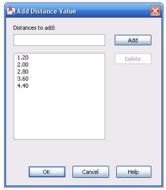
After that we need to add the values the list. Click on the 3 dots on the right of the "Dist Value List" Box. A dialog opens like the one below where you can add the list of values you want the distance parameter to take.
The 1.20 value is there because it is the value of the distance parameter when we created it. We will add the values 2.00, 2.80, 3.60 and 4.40. Now, you can exit the block editor and test the block. You will see that when you select the grip to stretch the table, some markers appear on the screen showing you the possible sizes coming from this list that we created.
Since we set the Array column offset distance to be also 0.80m any time we change the length of the table we will see some extra chairs appearing.
The great thing of dynamic blocks is that if used smartly they can simplify things a lot. Before you probably had a Block for a table sitting 4 people, another for a table sitting 6, another for a table sitting 8 etc. Now, you only need one configured like this one and it will work for all them.
Download the Block Here
Show me more...
SketchUp Plugins: Delete Unnecessary Lines
Imported drawings can have a lot of unnecessary lines, there is a plugin to remove them all with a single click.
Català - Castellano
When we import CAD drawings to generate 3D geometry from them we might end up with hundreds of lines that we don't really need. Cleaning up the drawing of unnecessary lines is important to work more efficiently, but it can be tedious sometimes.
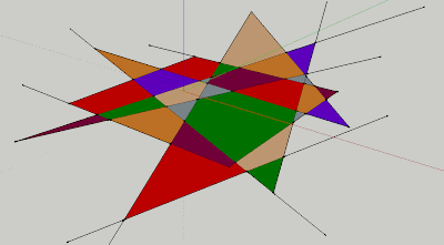
A Plugin that helps a lot on this task is the Stray_Lines.rb Plugin. With this plugin we can either Delete, Isolate (meaning hiding the rest of the model), Label or Select all the lines in a model that have an open end (and thus are not being used to generate a face). See the image below, where we have a bucnh of faces and lines that are not needed.
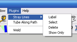
TO get rid of those lines, we could manually erase them. In this case it wouldn't take long, but imagine that instead of 10 lines like here we had 100 or 1000. So what we have to do is simply go to Plugins --> Stray Lines --> Delete. And it will delete any line with an open end.
See in the image that there are 4 options total. Each of them useful in a way or another. Try them out. You can download the Plugin here.
Show me more...
Labels:
Downloads,
File Clean Up,
Plugins,
SketchUp
AutoCAD Weekly Block #01: Dynamic Wardrobe
A Wardrobe Block 60cm deep that can adopt any length.
Català - Castellano - Deutsch
I am going to start sharing weekly some of the Blocks I've been creating for some of our projects. Some of them, like this one, will help us go through some of the basics on how to deal with Blocks. In this case, we will quickly go over how to create a Dynamic block again (there is a longer post from some months ago explaining in more detail How to Create a Dynamic Block).
Download the Block or see the image of the below.
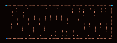
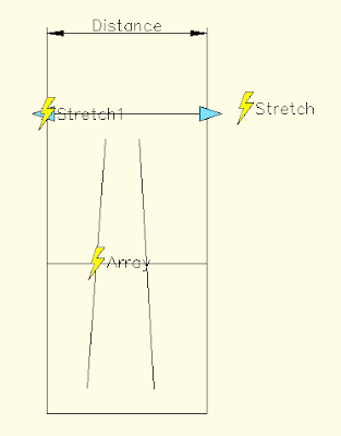
As you can see in the image, the block shows two arrows on its upper corners. These are the Grips that allow us to modify it's length. If you enter the Block Editor (select the Block and type BE) you will see something like this.
Lets see what each of the elements found does. Distance is teh Linear Parameter, it defines a distance that can be modified. Stretch is an Action. Actions associated to parameters is what creates the interactivity on dynamic blocks. The stretch and stretch1 action stretch the wardrobe on its length. The other element is Array. Array is another Action, and what it does is to repeat the two tilted lines when the block is stretch.
The process to create this block is simple. Once we have the basic linework that you see inside the Blockeditor (the outline and the two tilted lines) we do the folowwing:
Show me more...
Català - Castellano - Deutsch
I am going to start sharing weekly some of the Blocks I've been creating for some of our projects. Some of them, like this one, will help us go through some of the basics on how to deal with Blocks. In this case, we will quickly go over how to create a Dynamic block again (there is a longer post from some months ago explaining in more detail How to Create a Dynamic Block).
Download the Block or see the image of the below.
As you can see in the image, the block shows two arrows on its upper corners. These are the Grips that allow us to modify it's length. If you enter the Block Editor (select the Block and type BE) you will see something like this.
Lets see what each of the elements found does. Distance is teh Linear Parameter, it defines a distance that can be modified. Stretch is an Action. Actions associated to parameters is what creates the interactivity on dynamic blocks. The stretch and stretch1 action stretch the wardrobe on its length. The other element is Array. Array is another Action, and what it does is to repeat the two tilted lines when the block is stretch.
The process to create this block is simple. Once we have the basic linework that you see inside the Blockeditor (the outline and the two tilted lines) we do the folowwing:
- We create a Block out of this line work with origin on one corner.
- Enter the Block Editor, BE (do not edit block in place with REFEDIT command)
- We add a Linear Parameter from one corner to the other.
- To add the array action, click the actions button, select the distance parameter and enter array as action type. Then select the 2 tilted lines as objects and enter the distance you want the copies to appear my block uses 0.2m, but you can set it to anything you want)
- Now we add the Stretch Action. Again click the Actions button, select the Distance Parameter, Select Stretch as type of action, select one of the Distance parameter points, Draw a Polygon as you would do usng the STRETCH command and select the objects you want to Stretch. (be sure to avoid selecting the tilted lines)
- Do the same for the other side of the wardrobe with a new Stretch Action.
Show me more...
SketchUp Plugins: Creating Tensile Like Structures
Learn about a Plugin that will allow you too create Curved Tensile-like surfaces.
Català - Castellano
Soap Skin Bubble is a Plugin developed by Josef Leibinger intended to represent tensile like structures.
The truth is that as you will learn with some practice, it is a tool to create almost any curved surface based on it´s profiles. THe plugin includes a Flash animation that I am including below and that quickly shows some of the features of this Plugin.
The Plugin use is not very intuitive, in the beginning you might think it is not working properly. Just give it some trial an error and you´ll see you can achieve almost any shape with it, so it is worth the time it takes to get used to its "weird" behaviour.
You can download the Plugin here directly on the developer website. You can find some more information and examples that will help you understand better how to use the Plugin.
Show me more...
SketchUp Plugins: The Scale Tool Becomes Smart
Finnally someone made some sense and created a Plugin that allows us to scale the objects properly no matter they orientation
Català - Castellano
Thanks again to Jim and his amazing SketchUp Plugins Blog I came across the video you can see below that shows the very impressive FreeScale.rb Plugin developed by Fredo6.
I think the video speaks for itself, but basically what you should know is that the new Plugin allows you to Scale any object basing the bounding box alignment on any line you have in the drawing. (there is also an amazing Taper tool). This is no doubt one of those Plugins it is hard to believe it is released for free.
You can download the Plugin here and the library needed to run it here or go to the Plugin release thread. One of the most complete, easiest to use and most useful Plugins I've come across. Thanks Fredo.
Show me more...
SketchUp: How to Mirror Objects.
There are several ways to mirror objects in SketchUp
Català - Castellano
Mirror is not a standard tool in SketchUp, but that is probably because there are several ways to Mirror objects using other methods. There are to me 3 methods to mirror objects. Two of them can be done with the standard SketchUp installation, the third one (and probably the best) requires a Plugin. Let's see the 3 of them:
Show me more...
Català - Castellano
Mirror is not a standard tool in SketchUp, but that is probably because there are several ways to Mirror objects using other methods. There are to me 3 methods to mirror objects. Two of them can be done with the standard SketchUp installation, the third one (and probably the best) requires a Plugin. Let's see the 3 of them:
- We can select the object we want to mirror, right click on it and select "Flip Along:" This will give us the chance to select which plane (red, green or blue) of the object to use as a mirror plane. The negative part of this is that yo can't select the mirror plane. The mirror plane has to be one of the planes defined by the center of the object.
- We can use the Scale Tool. Select one of the grips (using the grips on the center of the faces of the object's bounding box is the best way to go) and type "-1" as the scale value on the Value Control Box (VCB). Again, we can´t control the mirro plane, it has to be one plane defined by the faces of the bounding box of the object.
- The third method is to use the Mirror.rb Plugin. This plugin is very easy to use and allows us to select the mirror plane and also to choose if we want to keep the original object or delete it after the mirror operation. It is by far the best way to go. To use the plugin (after saving it to your plugins folder) select the object you want to mirror and go to Plugins --> Mirror Selection. Then you will need to pick the 3 points that define the mirror plane, and at the end you will have te option to choose to either keep or erase the source object. Easy and simple, and a time saver.
Show me more...
SketchUp Plugins: Extrude Lines
Did you ever wanted to extrude just a line in sketchUp? There is a Plugin for it
Català - Castellano
Update: This is an old Plugin, there is a newer set of tools by TIG and a Plugin in it called ExtrudeEdgesByVector.rb that does this process much easier.
SketchUp has the Push / Pull tool that basically extrudes surfaces into volumetric objects. This, in a way, can work to extrude lines by extruding the surface and erasing the parts we didn't want to be extruded.
But there is a better way to do that in some cases, and this is to use the Extrude Lines Plugin. This Plugin simply extrudes a line or a set of lines into a surface.
See the next two images to see how from a line we got a surface by using this plugin.
Note: The Plugin shows @Last as Author of the Plugin, if anyone knows the original download page let me know.
Show me more...
Català - Castellano
Update: This is an old Plugin, there is a newer set of tools by TIG and a Plugin in it called ExtrudeEdgesByVector.rb that does this process much easier.
SketchUp has the Push / Pull tool that basically extrudes surfaces into volumetric objects. This, in a way, can work to extrude lines by extruding the surface and erasing the parts we didn't want to be extruded.
But there is a better way to do that in some cases, and this is to use the Extrude Lines Plugin. This Plugin simply extrudes a line or a set of lines into a surface.
See the next two images to see how from a line we got a surface by using this plugin.
The flaw of this plugin is that when trying to extrude arcs, it will consider the arch as a set of lines, producing an extruded surface like the one in the image below, with a lot of edges shown.
Personally, if I have to extrude arcs I use the Weld Plugin and the standard Push Pull operation.
You can download the Plugin here. To use it save it into the Plugins folder, select a line or set of lines and go to Plugins --> "Extrude Lines, vector by 2 points".
Note: The Plugin shows @Last as Author of the Plugin, if anyone knows the original download page let me know.
Show me more...
SketchUp 7: New Features and Download Link
See the new features of the latest SketchUp version.
Català - Castellano
Thanks to Jim and his SketchUp Plugins blog I got the link to the video below that explains the new and very cool features added to the new SketchUp 7.
I have to confess that I didn't even know that version 7 was already out (I only know that I know nothing). So if you feel like trying all these new features (and dynamic components look like the most awesome addition so far) here is the link to the download page.
Update: today mornig (Nov 17th) google has oficially released SketchUp 7 on the official sketchup blog.
Show me more...
SketchUp: Bonus Packs, Extra Materials and Components
Did you know that Google itself provides more Components and Materials than those installed in SketchUp?
Deutsch - Català - Castellano
The installation of SketchUp will provide you with a reasonable amount of components and materials. But if you feel like you need more, be aware that Google itself provides free bonus packs to download from this website.
Specially useful is (was) the set of new materials. (update: the set of extra materials is no longer available online) Be aware that installing this bonus packs will overwrite the previous components if they are of the same type. But don't worry, these extras come with all the standard components and materials that you normally find in SketchUp.
Show me more...
SketchUp Plugins: Volume Calculator
Discover a plugin that will allow you to calculate volumes of objects.
Català - Castellano - Deutsch
There is a useful plugin for Sketchup called VolumeCalculator21.rb. It allows us to calculate the volume of an object. The only requirements are that it needs the object to be a group or component, and for maximum accuracy the geometry has to be clean. For clean geometry basically we need that each edge has two faces, no more no less, but that will ensure that the volume calculation is precise.
I tried it with basic geometry and the results were exact, when I tried it with very complex and not clean geometry, I got different results from time to time, so the importance of using clean geometry is very clear.
Still, I think it is a plugin worth having. To use it (after downloading the plugin and saving it to the plugins folder in SketchUp) select the group or component you want to know its volume, right click, and you will find an option called volume. Select that and you will get a dialog box that will ask you for which units you want to use and other options. It is very simple to use.
You can download the plugin here. Thanks to the author TGI.
Show me more...
AutoCAD tutorial: Creating a dynamic block 1.0
Learn step by step how to create a dynamic block.
Català - Castellano
Dynamic blocks are a very important resource to increase productivity. What would require several different blocks can be achieved with a single dynamic one if we know how to give the right editing properties to them.
In this first tutorial we will create a dynamic block for an escalator. The block will be able to be stretched to have different step widths, overall lengths (to cover different floor to floor heights) and some other cool properties.
First of all we have to create a standard block. I got the escalator DWG from Schindler, the block is good enough for the precise height you request it. This is the drawing we will start with.
We will name this block Dynamic Escalator. To make this block a dynamic block we have to add Parameters and Actions to the block. To do so, select the blog and type BE (Block Editor). Inside the Block Editor you will find a series of buttons that will allow you to do that.
We have to plan what we want to do, and probably you will have to do things twice or trice till you make the block work as you want. To start we will set the parameters and actions that will let us modify the step width of the escalator. This are the steps we will follow.
Now, we need to add an action to this parameter. This are the steps to follow.
Try to save and go out of the block editor. Check that the block behaves the way it is expected. If it does we will continue adding parameters and actions.
Next we will make the block stretchable in length. This will require more than one action since we not only want to stretch the lines, but also make extra steps appear when we stretch the block.
We will do the following:
We want the step lines to show all the way from end to end of the escalator. We need to add an array action to the same linear parameter that we are using for stretching the block in length. We follow these process:
We still want to add a couple more parameters to the block. First we want text and an arrow that shows if the escalator is going down or arriving from the level below. We will use the text DN for going down, and AR for an escalator that arrives to the level we are showing. First we prepare the block for the actions we want to add.
The last edit I added to the block is a rotation aprameter and action that allows me to rotate the text to any position I want. The idea is that no matter in which angle the escalator is placed, the text should always be facing the right way. See the image below to understand what I mean..
I am not going to detail the steps for this since it is pretty simple and similar to the rest of the process. Just think of using a rotation parameter and action applied to the center of the text.
If you want to check the escalator file, you can download it here.
Show me more...
Català - Castellano
Dynamic blocks are a very important resource to increase productivity. What would require several different blocks can be achieved with a single dynamic one if we know how to give the right editing properties to them.
In this first tutorial we will create a dynamic block for an escalator. The block will be able to be stretched to have different step widths, overall lengths (to cover different floor to floor heights) and some other cool properties.
First of all we have to create a standard block. I got the escalator DWG from Schindler, the block is good enough for the precise height you request it. This is the drawing we will start with.
We will name this block Dynamic Escalator. To make this block a dynamic block we have to add Parameters and Actions to the block. To do so, select the blog and type BE (Block Editor). Inside the Block Editor you will find a series of buttons that will allow you to do that.
We have to plan what we want to do, and probably you will have to do things twice or trice till you make the block work as you want. To start we will set the parameters and actions that will let us modify the step width of the escalator. This are the steps we will follow.
- Click the parameter button
- Select Linear as Parameter Type.
- Select the two edges of one of the steps.
- Choose to show only one grip.
Now, we need to add an action to this parameter. This are the steps to follow.
- Click the Action Button
- Select the Parameter
- Choose Stretch As the Action Type
- Select the Grip
- Select the stretch Polygon (like you would select the objects using the STRETCH command)
- Select the objects to be stretched.
Try to save and go out of the block editor. Check that the block behaves the way it is expected. If it does we will continue adding parameters and actions.
Next we will make the block stretchable in length. This will require more than one action since we not only want to stretch the lines, but also make extra steps appear when we stretch the block.
We will do the following:
- Add a linear parameter to the length of the block
- Add a stretch action to stretch all the lateral lines of the escalator.
- Add an Array action to make new steps when the block is edited.
We want the step lines to show all the way from end to end of the escalator. We need to add an array action to the same linear parameter that we are using for stretching the block in length. We follow these process:
- Click the action Button
- Select the linear parameter.
- Choose Array as the action
- Select the single step line we have when prompted to select objects
We still want to add a couple more parameters to the block. First we want text and an arrow that shows if the escalator is going down or arriving from the level below. We will use the text DN for going down, and AR for an escalator that arrives to the level we are showing. First we prepare the block for the actions we want to add.
- We type both texts AR and DN on the same exact position.
- We mirror the arrow head so we have a line with arrows on both sides.
- Toggles objects on other visibility states on and off.
- Makes an object visible in the current visibility state
- Hides an object form the current visibility state
- Calls the visibility states dialog box (where we will create different visibility states)
- first we have to do is click button #4 and create a new visibility state called AR, and rename the existing one as DN.
- Having DN as active visibility state select the AR text and the arrowhead pointing to it and click button #3 to hide them. (the objects will diappear if you didn't click button #1, if you did the objects will be faded)
- Turn AR visibility state active, select DN text and arrowhead pointing away from it and hide them (button #3)
The last edit I added to the block is a rotation aprameter and action that allows me to rotate the text to any position I want. The idea is that no matter in which angle the escalator is placed, the text should always be facing the right way. See the image below to understand what I mean..
I am not going to detail the steps for this since it is pretty simple and similar to the rest of the process. Just think of using a rotation parameter and action applied to the center of the text.
If you want to check the escalator file, you can download it here.
Show me more...
Subscribe to:
Posts (Atom)